Color Blindness Friendly Color Palette: A Complete Guide
A color blindness friendly color palette keeps red errors distinct from green success messages, with safe colors and tools to test your choices.
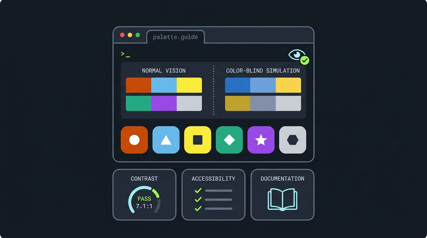
tl;dr the short answer
A color blindness friendly palette uses colors that remain distinguishable for people whose color vision makes certain hues blend together. Choose colors that differ in brightness as well as hue, avoid relying on red and green or other easily confused pairs, and add labels, symbols, or patterns; test the palette with color vision simulators and in grayscale. This makes information easier to read across interfaces without limiting you to a dull theme.
Picture a red error message and a green success line sitting side by side in your terminal, with a friend leaning over who can’t tell them apart.
A color vision deficiency, often called color blindness, changes how certain hues look, so a palette that’s crisp to you can blur for someone else.
This guide covers the main types of color vision deficiency, which colors cause the most trouble, and ready-to-use safe palettes. Then we’ll show you how to apply them in your terminal, editor, and desktop theme.
Color Blindness Friendly Color Palette Basics
Before you pick a single color, it helps to know who your palette has to work for. Here’s who’s affected and what you can do about it.
How many people have color blindness
About 8% of the world is affected by some form of color vision deficiency, the technical term for what most people call color blindness. That’s a lot of people.
A study on color contrast under the Web Content Accessibility Guidelines (WCAG) 2.0 calls color blindness an important accessibility consideration for website design.
It also points to criterion 1.4.1, the most elementary one (Level A, the most basic tier), which mainly relates to color blindness: color can’t be the only way you convey information.
Design tips beyond color choices
Color choices are only part of the job. These habits go a long way:
- Never rely on color alone. Pair each color with a symbol, label, or pattern so the meaning survives without it.
- Compare lightness, not just hue. Two colors that differ only in hue can look alike to some viewers, so make sure they also differ in brightness.
- Test your pairs. A contrast ratio measures how far apart two colors are in brightness, so run your text and background through a contrast checker before you commit.
Consider a Linux user with a tmux status bar where green means the last test run passed and red means it failed. They keep the colors but add PASS or FAIL beside each one.
Now the status reads at a glance, even if one shade looks muddy to someone looking over their shoulder.
For further reading, the WCAG 2.0 color contrast study linked above covers contrast requirements through 3D color space visualization.

What Colors Are Hard to See When Colorblind?
Colorblindness doesn’t mean seeing only black and white. It means certain colors blend together, and which ones depends on the type of color vision deficiency someone has.
Here are the pairs that cause the most trouble, plus the limits you’ll hit when you build your own palette.
Color pairs that cause the most trouble
These pairs most often blur together:
- Green and red: the classic trouble pair, since the two can look nearly identical.
- Green with brown, grey, or black: greens sink into these darker tones.
- Blue and purple: both cool shades can merge.
- Light green and yellow: pale tones lose their contrast.
- Blue and grey: both can look like muted, cool tones.
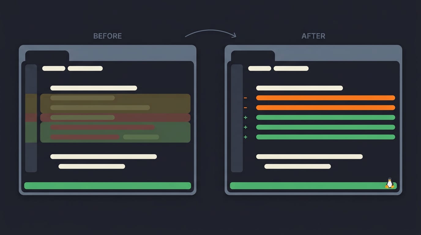
- Fixing red/green in syntax and diffs: red and green highlights in code are the usual suspects, so swap one side for a different hue.
Take a Linux user who keeps nvim open in a tmux pane and runs git diff all day. Their red deletions and green additions blur together, so every change takes real effort to scan.
Shifting the deletions to blue or orange lets them spot edits at a glance again. Same terminal, clearer diffs.
Limits that shape your palette choices
Your palette runs into three limits:
- Palette design is subjective. What looks clear to you may still blur for someone else, so test your choices.
- Logo and brand guideline limits. Some projects lock certain colors in place, so you tune the rest around them.
- Advice mostly says what to avoid. Most guides list the pairs to skip but leave you guessing. Figuring out what to use is the harder question, and we’ll tackle it shortly.
Building a Color Blind Safe Palette
Your palette might look great on your own screen, but that’s only one pair of eyes. Here’s how to test your colors against color vision deficiency (often called colorblindness) before you carry them into your terminal and editor.
See the palette through colorblind eyes
Picture a Linux user who builds a palette from a rainy-street wallpaper: a deep teal background, amber for warnings, and a soft red for errors. On their own monitor, the error text pops.
Their partner, who has red-green color vision deficiency, may see that red as nearly the same brown as the green diff lines. A quick check now means the errors stay readable for both of you.
Color vision deficiency comes in three main types, and each one shifts colors differently:
- Protanopia: reduced sensitivity to red, so reds look darker and can blend into browns.
- Deuteranopia: reduced sensitivity to green, so greens and reds can merge.
- Tritanopia: reduced sensitivity to blue, so blues and yellows can blur together.
Run your palette through a color blindness simulator for all three types. If two colors merge in any view, swap one out.
Strong contrast helps everyone, not just viewers with color vision deficiency. Pick colors that differ in brightness, not just in hue, so text stays readable even when two hues blur. For a quick test, convert the palette to grayscale.
If the colors still separate, you’re in good shape.
Once a palette passes, copy its hex values (the six-character color codes that start with #) into your terminal’s color config and your editor’s colorscheme so every tool uses the same mapping.
For example, a tmux user who uses one red for errors in their shell prompt and their nvim diagnostics never has to wonder which red means trouble. That’s the whole trick.

Tools for Building Colorblind Friendly Palettes
You don’t have to guess whether a palette works. A few tools can check it for you.
Using the PrettyCols R package
If you already use R, a programming language built for statistics, the PrettyCols package is a good place to start. Install it from the Comprehensive R Archive Network (CRAN) using install.packages().
Its listing function shows the friendly palettes it includes, and you can filter that list by type.
Think of a terminal tinkerer building a palette for a friend who struggles with certain colors. They filter the list, pick a candidate, and run it through the colorblindcheck package before pasting the hex codes into a config.
That’s a check you run before you commit, not after your setup looks wrong.
Simulators and guides for testing colors
A Chrome extension simulates colorblindness right in your browser, so you can see a page the way a colorblind viewer would. The question is what they see, not whether you like the look.
You can simulate colorblindness on your Linux desktop too, so you preview your bar, terminal, and editor together. Consider a hyprland user who runs a simulator over a screenshot and spots two bar colors blending together.
One small tweak later, they stand apart.
Accessibility design guides explain the principles behind safe color choices, so skim one before you finalize. Test early. Fixing one color now beats rebuilding a whole theme later.
The big takeaway is that a color-blind-friendly palette doesn’t have to be a dull one.
Once you understand the types of color vision deficiency, know which hues cause trouble, and have a few safe palettes to start from, you can build a theme that still feels like yours.
Apply it across your terminal, editor, and desktop, and check that the differences that matter still stand out. Your desktop should look like you. It should also be easy to read for everyone who sees it.
References
- Understanding WCAG2.0 Colour Contrast Requirements Through 3D Colour Space Visualisation. — pubmed.ncbi.nlm.nih.gov (2016)
Questions
What colors are hard to see when colorblind?
The colors that are hardest to distinguish depend on the type of color vision deficiency. Red and green are a common trouble pair; green may also blend with brown, gray, or black, while blue can blend with purple or gray, and light green with yellow.
Sources
- Understanding WCAG2.0 Colour Contrast Requirements Through 3D Colour Space Visualisation., pubmed.ncbi.nlm.nih.gov,
Read next.
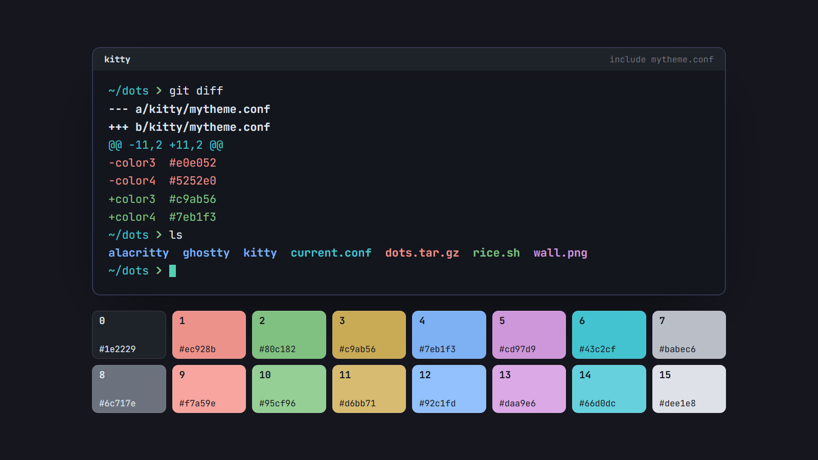
How to make your own terminal color scheme
Build a terminal palette from scratch: a background and text, sixteen ANSI colors evened out in OKLCH and checked for contrast, then loaded and made light too.
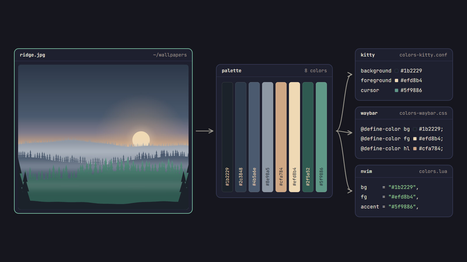
Color scheme from wallpaper: pywal, wallust and matugen
How pywal16, wallust and matugen turn a wallpaper into a color scheme, which fits your rice, how to wire it into your apps, and when a fixed palette is better.

Windows XP Screen: Boot, Bliss, and Luna Explained
Windows XP screen nostalgia starts with the boot animation, Bliss wallpaper, and Luna visuals; see how to preview the look safely in your browser.